Skyeng x The Centre of Attention

Skyeng x The Centre of Attention

Skyeng, online English school, 84,600+ students ยท The Centre of Attention, supporting deaf people in everyday life

Skyeng, online English school, 84,600+ students ยท The Centre of Attention, supporting deaf people in everyday life

Art direction and motion design for a campaign to make English learning accessible for the deaf and hard-of-hearing community.

Art direction and motion design for a campaign to make English learning accessible for the deaf and hard-of-hearing community.

Art direction and motion design for a campaign to make English learning accessible for the deaf and hard-of-hearing community.

Role

Visual Designer
Motion Designer

Team

Web Designer

Motion & Visual Designer

CMO

Problem

Two brands with distinct identities needed to merge into one coherent campaign that could reach people unfamiliar with either,
and communicate a free English course built for an underserved community.

Goal

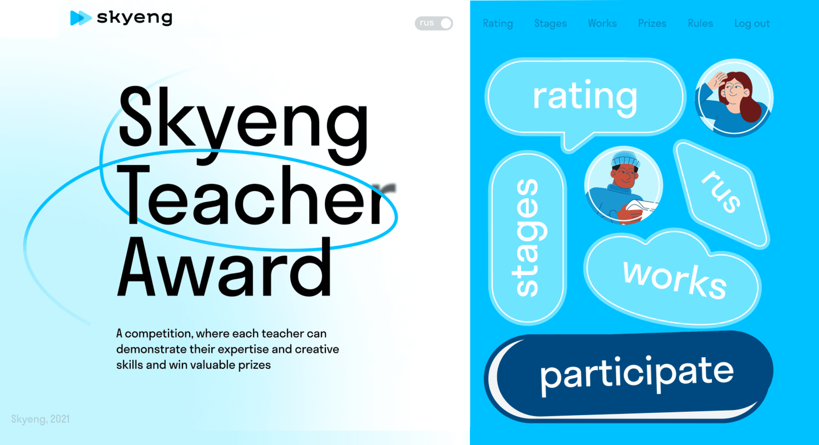
Built the visual concept around the Centre's illustration style, merging it with Skyeng's bright, sticker-based brand language. Art directed
the full campaign, landing page concept, motion design, and promo video. The video was broadcast in Moscow's subway network.

Create a visual identity that would show Chainflip as an established company in space, not a startup anymore. Redesign and grow a website that now connects the four pieces of the puzzle: swappers, liquidity providers, integrators, and lenders. Build tools that could speed up production times and be used by non-designers.

Results

Delivered across three teams in one month.

Create a visual identity that would show Chainflip as an established company in space, not a startup anymore. Redesign and grow a website that now connects the four pieces of the puzzle: swappers, liquidity providers, integrators, and lenders. Build tools that could speed up production times and be used by non-designers.

The promo video ran across Moscow's metro network for 6 weeks, reaching millions of daily commuters.

Create a visual identity that would show Chainflip as an established company in space, not a startup anymore. Redesign and grow a website that now connects the four pieces of the puzzle: swappers, liquidity providers, integrators, and lenders. Build tools that could speed up production times and be used by non-designers.

Initial idea was based around illustration style of the Centre, which merged perfectly with Skyeng's brand identity, bright colors,
lines as paths and stickers

Motion video

The concept had two ideas running in parallel:
1. Anyone can learn English regardless of their circumstances
2. The course itself opens up a new world.


The video opens with how a beginner approaches a new language: quiet, undiscovered, empty. Sign language is woven in naturally.
Colour only arrives after the course is introduced, as a visual metaphor for what learning unlocks.

As large part of the campaign, the produced video was shown across Moscow's subway.

Once the visual concept was agreed, the landing page was built. The motion video followed, art directed for the campaign
and broadcast across Moscow's subway network.